What to Expect Project
Non-Profit Site Redesign 2021

OVERVIEW

WTEP is a non-profit organization that supports expecting mothers around the world. My team of three was tasked with redesigning the What To Expect non-profit website to increase donations and involvement in the community.
UX Role
-
Lead UX Design & Strategy
-
Lead Research & Analysis
-
Wireframes
-
Prototyping
-
Assisted Visual Design
Scope
About three months to do research, design 30+ pages, and translate to mobile and tablet.
DISCOVERY & ANALYSIS
Began by leading the research activities that included doing a deep analysis of the original system to find gaps and opportunity areas, as well as comparative research to be sure we effectively provide the best experience.
Current-State Analysis
The goal of the analysis was to determine how usable, intuitive, and enjoyable the site was. Did it function successfully while providing a delightful experience?
-
No storytelling and thoughtful flow meant we needed to elevate the mission, elicit emotions and deliver a clear message that helps guide users through the site.
-
Discoverability and navigation were not intuitive and needed IA reorganization so visitors can locate resources, articles, where to donate, and ways to get involved.
-
Lack of cohesion in the design elements and content heavy pages gave the brand less sophistication and authenticity.


Out in the Wild Research
Took a look at 10+ non-profit organizations in various industries to be sure we effectively provide resources, educate, increase involvement, and capture donations while being empathetic.
-
Empathetic storytelling with
powerful messages -
Discoverable resources with
tailored filtering -
Intuitive menu and in-page navigation
-
Elevated Donation CTA and ways to
get involved -
Cohesive branding and design elements
-
Impactful data and insights to
draw emotions
Features and Functionality Takeaways:
DEFINE
With our knowledge from the current-state and competitive analyses findings, we knew we needed to focus on reorganizing the information architecture and tell a more visually impactful story. Using Figma, a whiteboard, and Miro we began ideating the solution.

I began by brainstorming and mapping out the site on Figma's whiteboard tool, FigJam. With the site map and user flows I'm able to determine the necessary pages, main navigation and IA, helping me to clearly define the basic features and main user journey. Sketching on paper or a whiteboard first allows me to quickly make iterations to flows and layout. In this process I made many iterations focusing on streamlined wayfinding and a cohesive story.
Brainstorming & Ideation
THE OUTCOME
From low-fidelity sketches, to high-fidelity wireframes, to final designs. We created 30+ page designs that create a cohesive story and flow. Ultimately driving visitors to explore how to get involved, donate, and learn more.
Final Designs


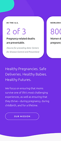
The goal was to create a story about WTEP's mission to support moms before, during, and after pregnancy and why this mission is so important. Additionally, we wanted to enhance the in-page navigation so that visitors are guided through the experience, whether they want to learn more about WTEP's mission and story, explore the initiatives, or learn how to get involved. On each page of the site we drove to create user-friendly designs with modern interactions.


Homepage
Donation Process
#BumpDay Social Media Campaign
THE LIVE WEBSITE
See how our designs have translated into a live and successful non-profit website experience.
